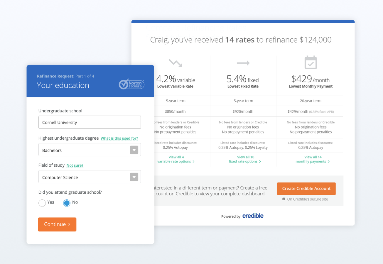
Redesigned prequal form
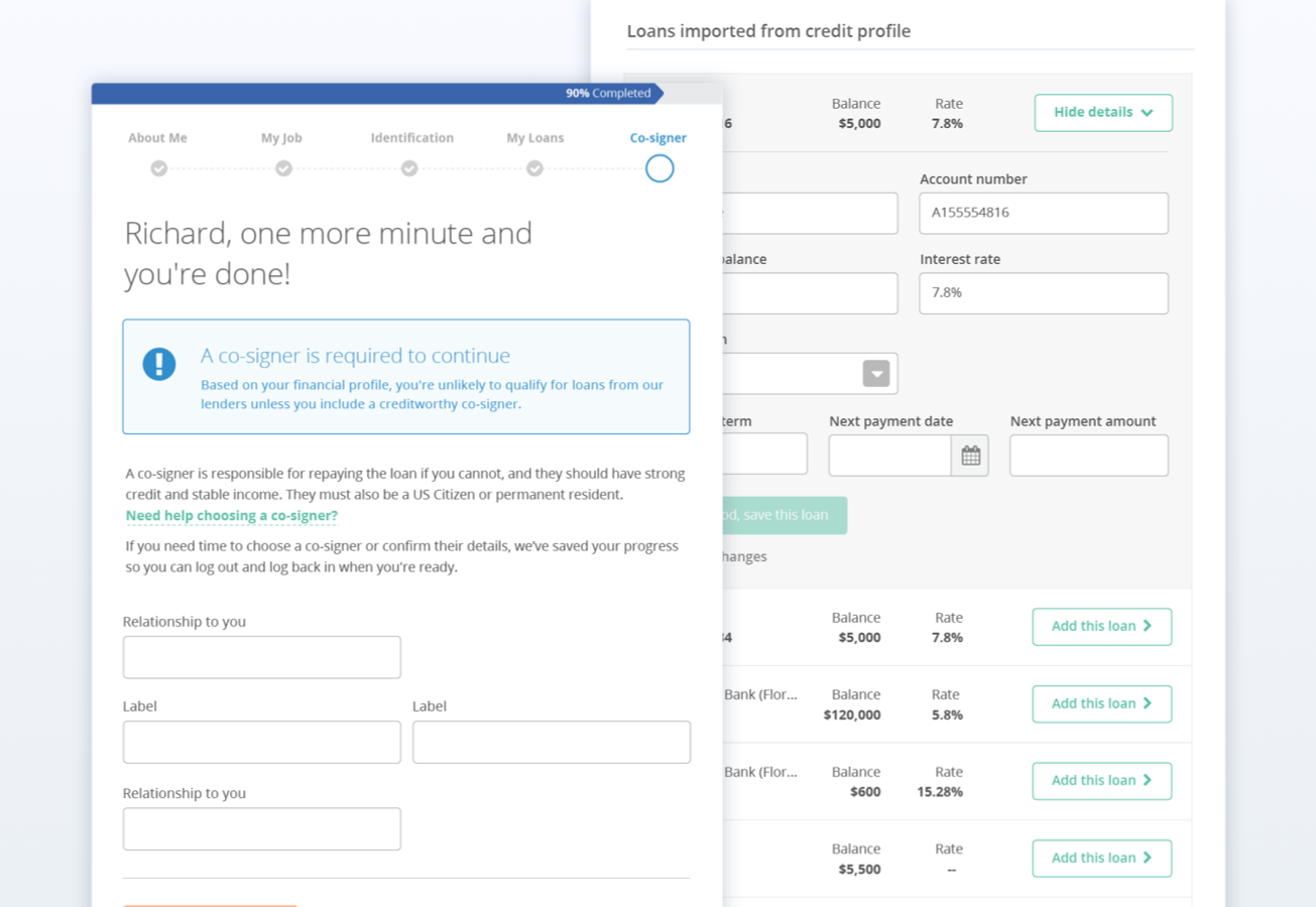
Designed complex flows including adding a co-signer and importing loans
Designed embedded forms for partnership sites
Welcome to my portfolio! Check out my work as a product designer at Credible as well as other side projects.
I led the redesign of Credible's student loan refinancing form, including the user research, visual and interaction design. I worked on our prequalification, firm request, and embedded form.
Contributions: user testing • user flows • visual design • responsive design • animations
Problem
Credible is a rate comparison site that helps customers find and apply for the best loan option from multiple lenders.
Our big design challenge was figure out how to get people to trust us with their personal information so we could provide them with prequalified rates.
Impact of this problem
Users have shown intent by clicking a CTA that leads them to the application, but drop off immediately or in the middle of the application.
Run A/B tests on the baseline design and new proposed design to see if more users are completing and submitting the form.
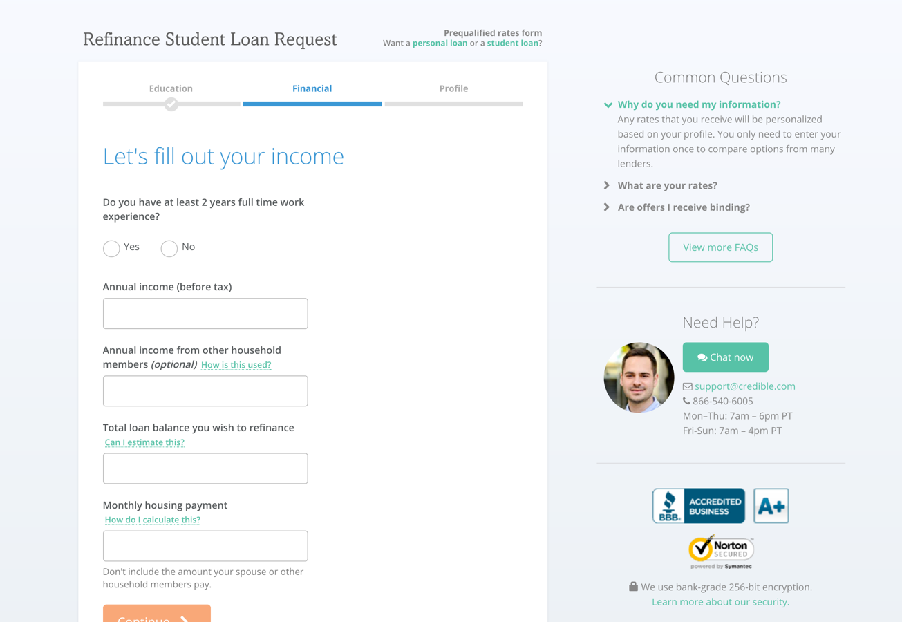
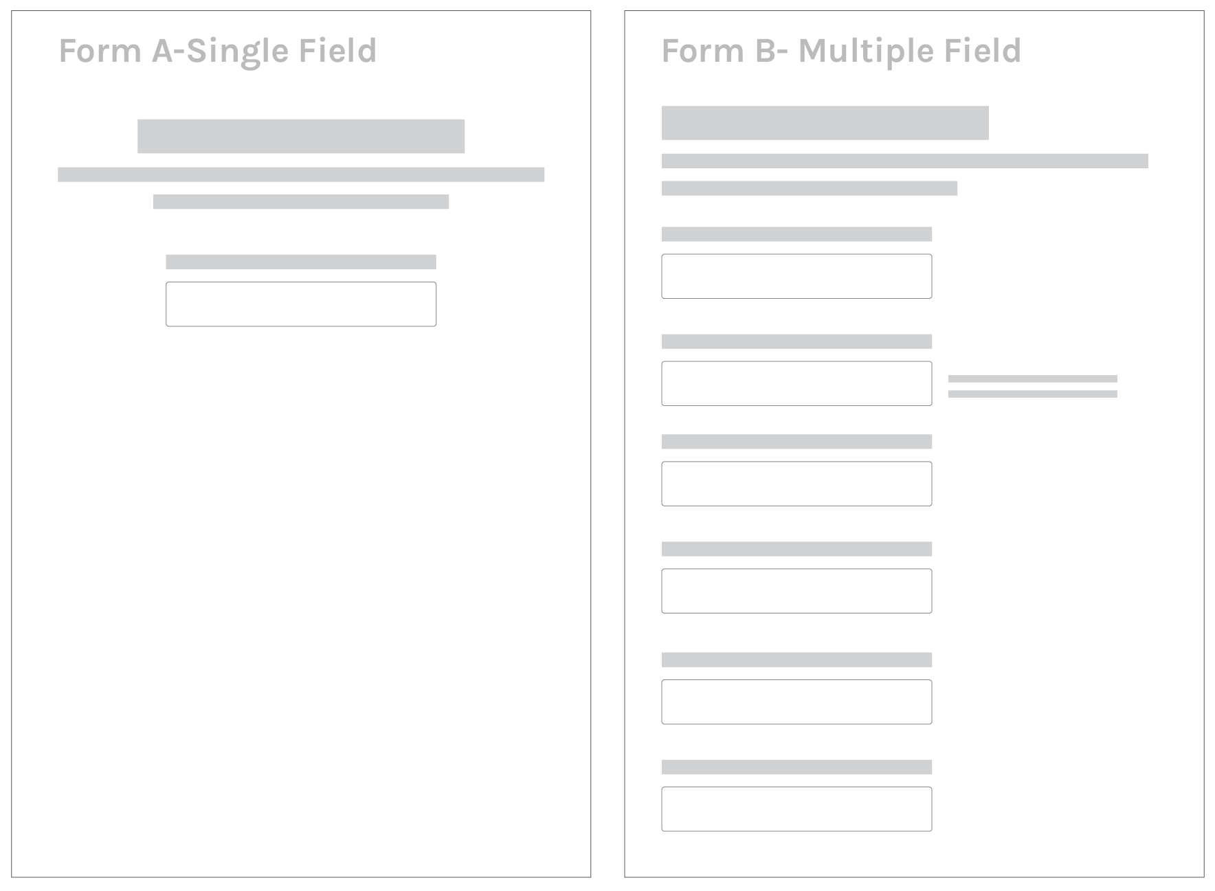
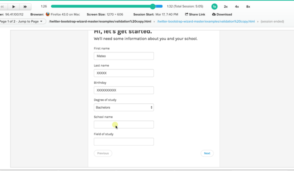
Current Implementation: All 18 form fields are shown on one page.
Proposed Form A. Single field per page.
Ask only one question per page. This will allow for more context and conversational language.
Proposed Form B. Divide form into 3 sections.
Break the form into three pages with less sensitive questions on the first page.
A. A/B tests for the form
I conducted user research on the existing form (all form fields on one page) and discovered that there’s a segment of users who scroll all the way to the end of the form and abandon and users who start to fill out the form but drop off at a specific field such as phone number.
We also knew through analytics and feedback from our customer support team that the most frequently clicked tooltips were for the fields: phone number, household income, and loan balance.
How do people feel when they are asked sensitive fields? Refinancing student loans can seem like a daunting process and I’m interested in discovering if users are more interested in efficiency--getting through the form as fast as possible or understanding the process, even if it takes longer. Are people abandoning because they've encountered a sensitive question or because they don’t have the information on hand and need to find it somewhere else?
Methodology
I used a within-subjects study design (users completed both application designs but were randomly assigned to begin with Design A or Design B) and asked to think out loud as they went through the usability tests. They also completed a post-interview and survey afterwards.
Participants
6 users (4 females and 2 males) between the ages of 18 and 27 participated in the study. Four
were undergraduates and two were graduate students. All of them currently have student
loans and are attending college in a large metropolitan city. They are tech savvy and frequently
use the internet.
Limitations of study
The sample size is not representative of our user base. Participants in this study skew towards students aged 21-24 attending an urban public college on the west coast. However, the purpose of this study was to test the usability of the design in order to gauge which layout engineers would build first. Engineering would still build both designs to validate the findings but due to engineering constraints, we wanted to know if we should allocate resources to build Form A or B first.
Most of the prototyping tools didn't fit my needs so I created HTML versions of the page with form validation.
B. Screen recording of user going through form
UX copy can help build trust
One interesting takeaway was the power of language in building trust. For the 'Expected graduation/completion date' question, I added the comment “Sending you good vibes” after users added their date. It elicited positive feedback such as, “Aw, that's cute” and “This is nice.” For the 'Loan balance' field, I included “Let us know how much you'll need and we'll work our magic =)”. This also generated smiles and chuckles; however, one user commented, “I don't know if I like emoticons handling something about loans or money. Too informal.”
Finance can be intimidating for many people and injecting some human elements reduces the tension and can make users feel more comfortable. However, it has to come at the right context. When there’s a moment of confusion for the user, it can raise a red flag about the legitimacy of the site. This erosion of trust happened with the example of being too informal during a serious financial question.
Help text needs to be helpful
For finance-related questions such as Loan Balance, users wanted to know HOW to answer it correctly. For sensitive fields such as a phone number, users were more interested in WHY we needed that information.
Discovery of two types of user personas
4 people preferred the multi step page and 2 people preferred the single form per page. Since users completed both forms, they were able to make a direct comparison and everyone agreed that single field form felt longer.
Two camps of people emerged:
1. Those who wanted to get through the form quickly. These people were also less likely to read through the help text and more frustrated by the time it took to finish the other design.
2. Those who want to be walked through the process. “It feels more personalized. Step by step feels more like what would happen if you went to a loan officer.”
One interesting approach would be to allow users to choose between a guided or no frills approach when filling out the application.
Next steps
We decided to move forward with the 3-step form and incorporated some delightful copy. We only included it when we thought there might be user fatigue as reading additional copy would also slow down the experience. I finalized the designs and built high fidelity mocks for the engineering team.
We A/B tested the new design against the baseline design.The 3-step form increased desktop conversion by 10% and lifted mobile conversion by 40%. Huzzah!

Animated farting pig for loading screens.
Redesigned prequal form
Designed complex flows including adding a co-signer and importing loans
Designed embedded forms for partnership sites
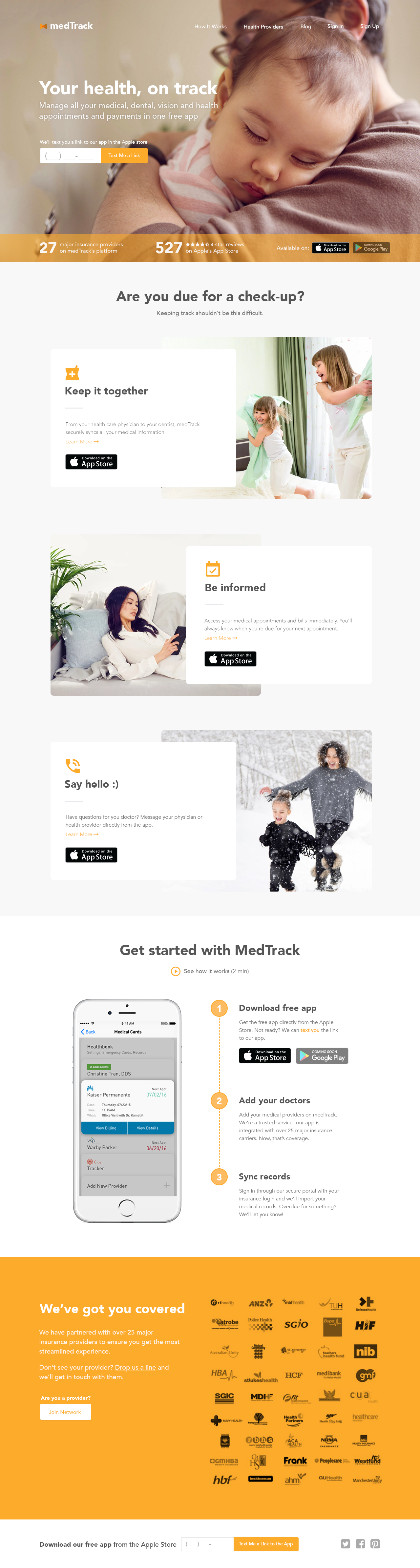
This is a personal project for the Mint.com of health care. I came up with this idea after having to set up appointments for my optometrist, doctor, and dentist on all different platforms.
I wanted to flex my marketing and UX copy skills for the landing page. Content impacts the direction and constraints of the design, so it's not helpful to design with dummy data or copy. I think it's important for designers to be able to draft copy to ensure the messaging is straightforward, helpful, and conversational for the customer. The exact language and voice of the brand can be refined afterwards.
Contributions: marketing and UX copy • visual design
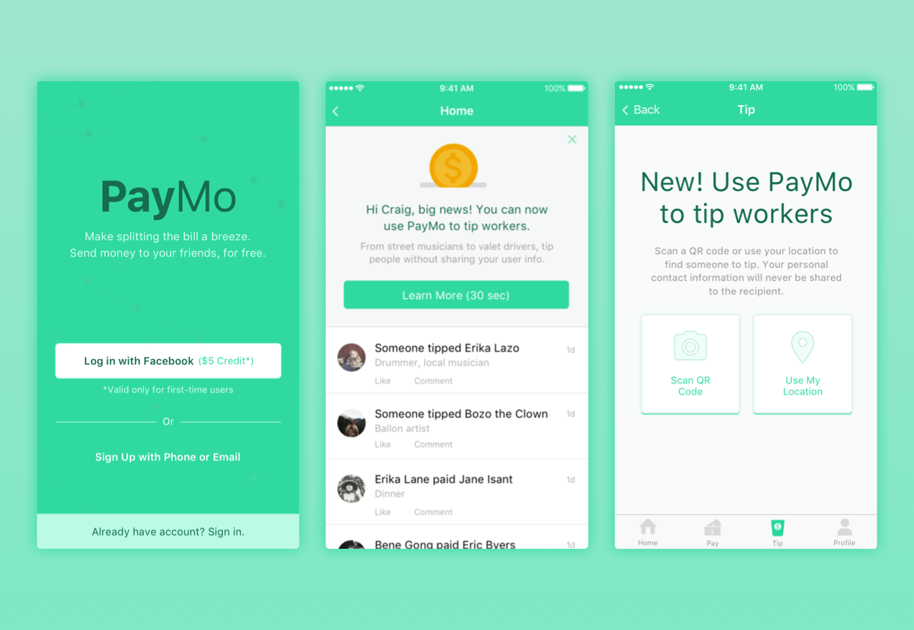
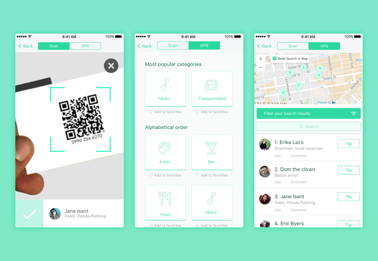
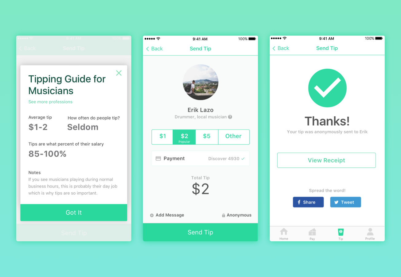
Although we live in a cashless society, some industries are still dependent on cash tips such as street musicians and valets. I decided to make an app for those who want to tip workers but don’t have cash on hand as this is usually true for me. I consider this a feature and not a product so the mocks show a payment app with a new feature where users can send money without sharing personal contact info.
Contributions: user flows • UX copy • mobile design • visual design
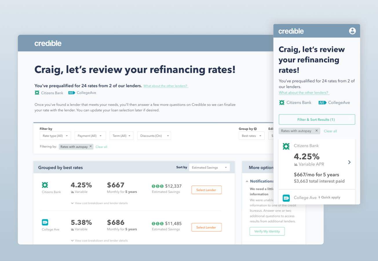
Most people are aware of the concept of comparing rates for refinancing a car loan or home mortgage but for many, refinancing student loans is a new concept.
For most users, this will be the first loan they refinance so I wanted to help them understand the relationship between the numbers shown on the dashboard. Previously, the rate, rate type, monthly payment, and term were displayed as four separate columns. I restructured the content to create user friendly sentences that combined figures that related to each other (e.g. 4.25% variable rate, $667 for 5 years).
Contributions: user testing • user flows • visual design • responsive design • animations
Designed mobile and desktop dashboards

Animated dashboard tiles as they load
Using my previous experience at San Francisco State as a web accessibility analyst, I audited our current website in terms of UI, design, keyboard accessibility, and content against WCAG guidelines (AA compliance). I provided recommendations and created documentation in the style guide on how to adhere to the standards.
Contributions: WCAG 2.0 audit and guidelines
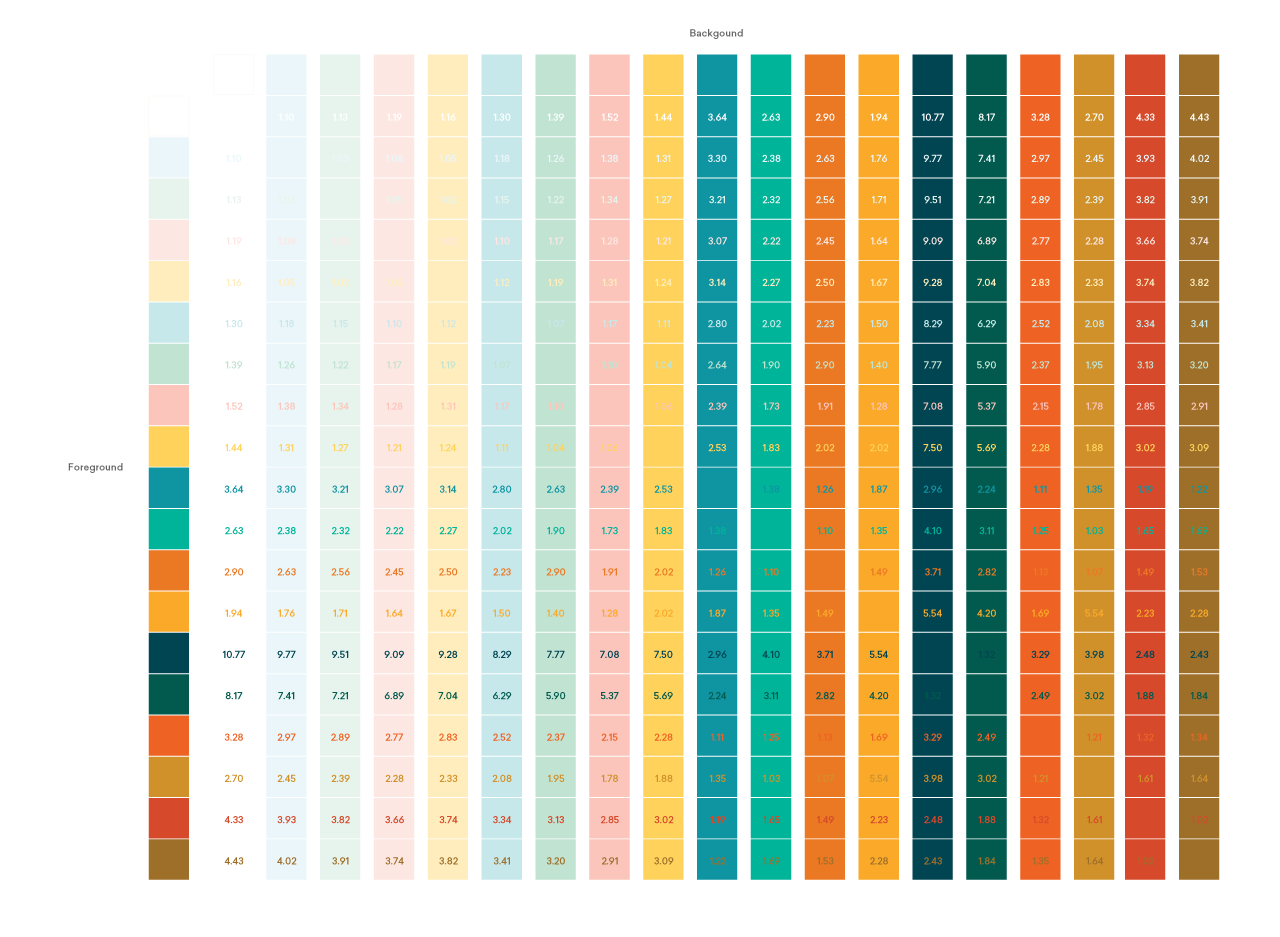
Accessibility color matrix
My accessibility presentation to the product and design team to create buy-in for making improvements to our website